


![]() Press Release
Press Release
22KB
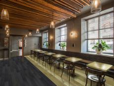
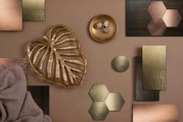
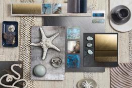
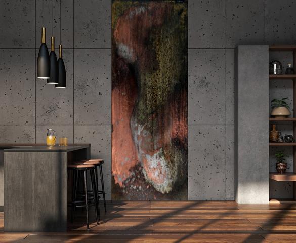
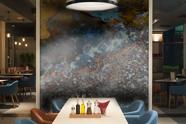
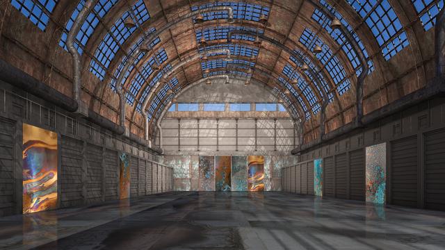
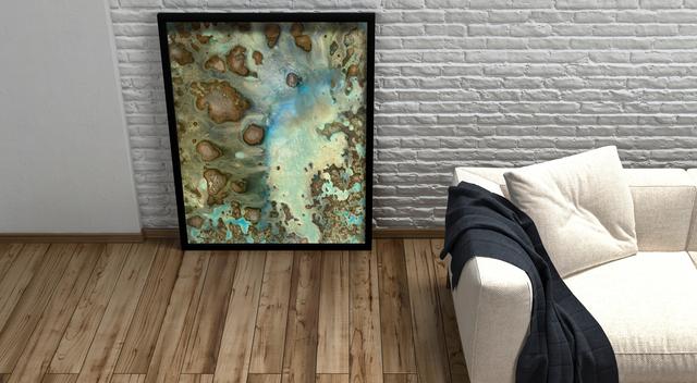
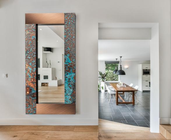
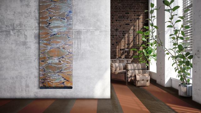
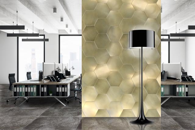
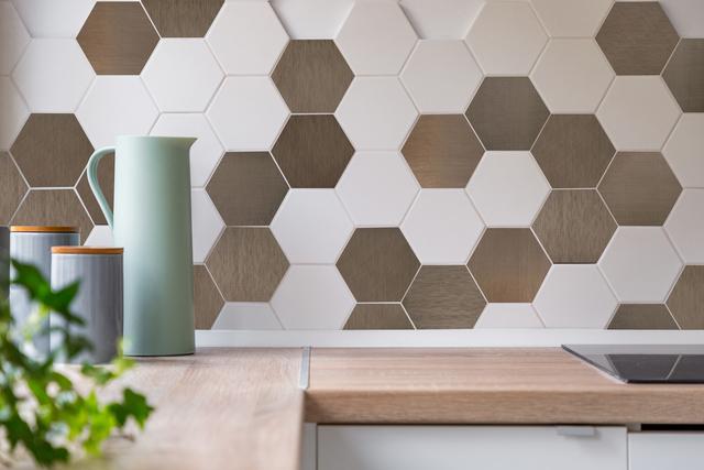
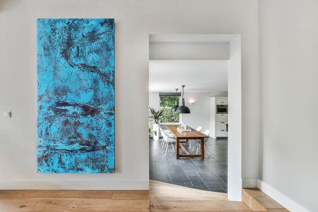
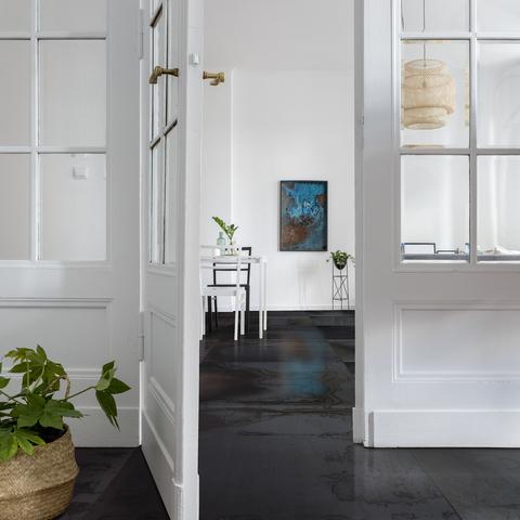
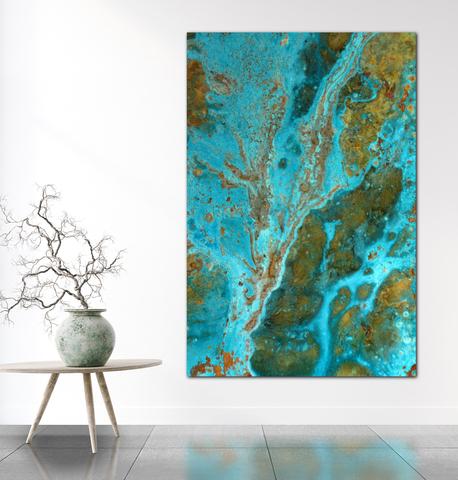
On a visual level, our culture linked to images often exploits a "dichotomous" theme to create harmony through a pattern or something that generates scenographic virtuosity. Clearly if in thought this way of arguing often gives a moral sense to speech, with shapes and colors it is instead an opportunity not to send a message, but to showcase diversity by placing them side by side. Let us see it in the example of the metallic textures of Planium to decorate with floors and walls.
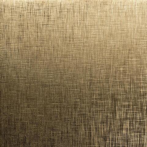
In the brand, the variety of brass, copper and various types of steel give life to different collections: Charme, Silver and Eclipse. The Metal-Morphosis collection features designer oxidized slabs starting from natural metals. All thanks to controlled oxidative processes that generate surprising colors and create artistic surfaces and unique coatings.
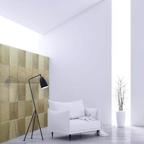
With these oxidations, combinations of this type become realistic for furnishing interiors with metal, with a smooth texture in its metallic "integrity" alongside an oxidized metal texture that represents an explosion of colors.
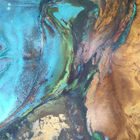
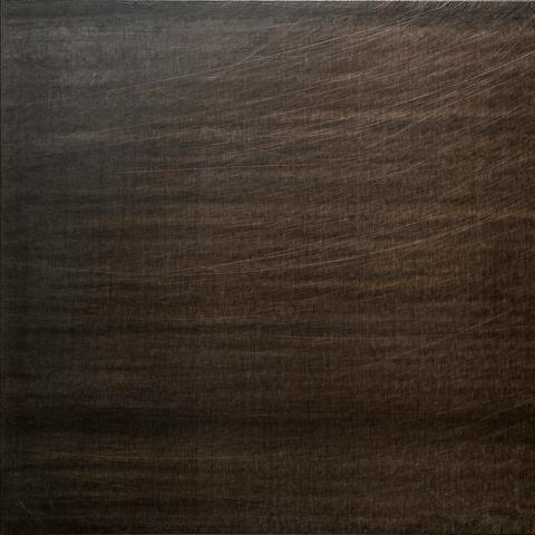
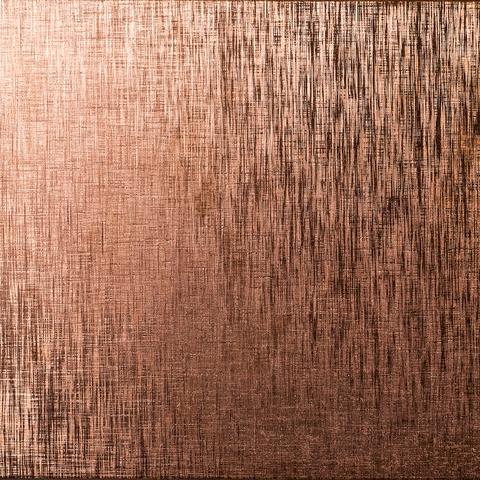
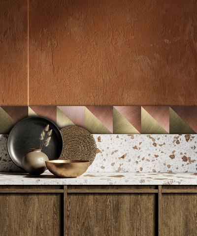
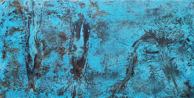
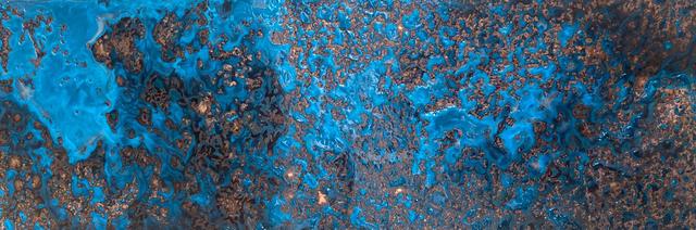
The Color Contrast. Copper with Copper.
Thus it will be possible to alternate, for example, coppery, an essentially warm color, an oxidation of copper which, while retaining its base, opens up to decidedly more expansive tones and horizontally to bluish colors and linked to shades of blue, representing settings similar to the seabed, but also to cartographies, as close as it is to the land-water union. The "smooth" Copper, therefore, in its basic textures, allows with the juxtaposition of the oxidized Copper a chromatic range that can lead to a double direction and to a scenography that covers at least two different directions, and all starting from the same material. The "red" (or "red/orange") base is accompanied by a riot of colors with unpredictable shades that break up the monochrome and constitute an alternation that will be able to mark the interiors of 2023.

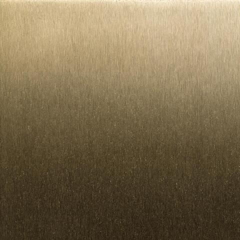
Rame Ossidato
![]() 6240x3512, 23MB
6240x3512, 23MB
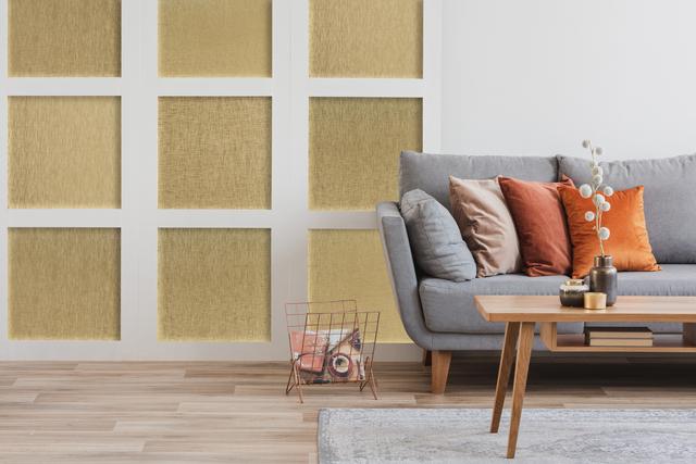
Rame Ossidato ambientata
![]() 1864x2000, 2MB
1864x2000, 2MB
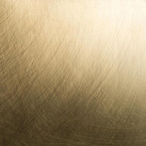
Rame spazzolato
![]() 1500x1467, 2MB
1500x1467, 2MB
![]() Press Release
Press Release
22KB
Related news |
||
|
|
|
april 17, 2024
|
february 28, 2024
|
october 18, 2023
|
|
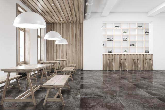
Welcome to the Planium world, where elegance blends with functionality to offer perfect solutions also for the catering sector. Ou... |
Planium by Terenzi Srl was born from the necessity to renew. Needs change and often, as in the case of the public sector, intended... |
A patch of oceanic blue expands, you see red-hot lava making its way, opening a passage or a galactic nebula, floral motifs, inlai... |
You might be interested in |
||
|
|
|
october 02, 2023
|
august 30, 2023
|
july 11, 2023
|
|
As the cold season approaches, it will be easier to close the door and live indoors. Cocooning is the rediscovery of tranquillity ... |
Autumn opens a year of challenges. The colors of the season soften those of summer with warm and intense shades.The arrival of the... |
PLANIUM continues its research towards new interpretative forms of Metals. The Oxidations, which we are able to generate in a natu... |
© Copyright 2024


 Italian
  Share
Share Share via mail
  Automotive
 Sport
Sport Events
 Art&Culture
 Design
 Fashion&Beauty
 Food&Hospitality
 Technology
 Nautica
 Racing
 Excellence
 Corporate
 OffBeat
 Green
Green Gift
Gift Pop
Pop Heritage
 Entertainment
 Health & Wellness